Bollinger Bands Z-ScoreBollinger Bands Z-Score Indicator
This indicator transforms the classic Bollinger Bands into a Z-Score oscillator displayed in a separate pane. It standardizes the Bollinger Bands’ basis line by calculating the Z-Score over a user-defined period, allowing you to see how many standard deviations the price deviates from the mean.
Upper and Lower Fixed Lines: These are set at +2 and -2 Z-Score levels, representing common thresholds for overbought and oversold conditions.
Z-Score Oscillator: The normalized Bollinger Bands oscillate smoothly between these fixed boundaries, providing a clearer perspective on volatility extremes.
Z-Score Table: Displayed on the right side, this table shows the current Z-Score value, along with fixed maximum (+2) and minimum (-2) limits, making it easy to track current momentum and volatility in real-time.
Use Cases:
Identify overextended price moves with standardized volatility measures.
Spot potential reversals or continuation setups by observing the Z-Score crossing key levels.
Complement traditional Bollinger Bands analysis with a statistically normalized perspective.
Input Parameters:
Length: The period used for Bollinger Bands and Z-Score calculation.
MA Type: Choose the moving average type for the basis line (SMA, EMA, SMMA, WMA, VWMA).
StdDev: Multiplier for the standard deviation bands.
Z-Score Length: The lookback period used to compute the mean and standard deviation for Z-Score normalization.
This indicator is perfect for traders seeking a statistically sound and visually clear representation of Bollinger Bands volatility and extremes.
Поиск скриптов по запросу "key levels"

Order Block Matrix [Alpha Extract]The Order Block Matrix indicator identifies and visualizes key supply and demand zones on your chart, helping traders recognize potential reversal points and high-probability trading setups.
This tool helps traders:
Visualize key order blocks with volume profile histograms showing liquidity distribution.
Identify high-volume price levels where institutional activity occurs.
rank historical order blocks and analyze their strength based on volume.
Receive alerts for potential trading opportunities based on price-block interactions.
🔶 CALCULATION
The indicator processes chart data to identify and analyze order blocks:
Order Block Detection
Inputs:
Price action patterns (consolidation areas followed by breakouts).
Volume data from current and lower timeframes.
User-defined lookback periods and thresholds.
Detection Logic:
Identifies consolidation areas using a dynamic range comparison.
Confirms breakout patterns with percentage threshold validation.
Maps volume distribution across price levels within each order block.
🔶Volume Analysis
Volume Profiling:
Divides each order block into configurable grid segments.
Maps volume distribution across price segments within blocks.
Highlights zones with highest volume concentration.
Strength Assessment:
Calculates total block volume and relative strength metrics.
Compares block volume to historical averages.
Determines probability of reversal based on volume patterns.
isConsolidation(len) =>
high_range = ta.highest(high, len) - ta.lowest(high, len)
low_range = ta.highest(low, len) - ta.lowest(low, len)
avg_range = (high_range + low_range) / 2
current_range = high - low
current_range <= avg_range * (1 + obThreshold)
🔶 DETAILS
Visual Features
Volume Profile Histograms:
Color-coded bars showing volume concentration within order blocks.
Gradient coloring based on relative volume (high volume = brighter colors).
Bull blocks (green/teal) and bear blocks (red) with varying opacity.
Block Visualization:
Dynamic box sizing based on volume concentration.
Optional block borders and background fills.
Volume labels showing total block volume.
Screener Table:
Real-time analysis of order block metrics.
Shows block direction, proximity, retest count, and volume metrics.
Color-coded for quick reference.
Interpretation
High Volume Areas: Zones with institutional interest and potential reversal points.
Block Direction: Bullish blocks typically support price, bearish blocks typically resist price.
Retests: Multiple tests of an order block may strengthen or weaken its influence.
Block Age: Newer blocks often have stronger influence than older ones.
Volume Concentration: Brightest segments within blocks represent the highest volume areas.
🔶 EXAMPLES
The indicator helps identify key trading opportunities:
Bullish Order Blocks
Support Zones: Identify strong support levels where price is likely to bounce.
Breakout Confirmation: Validate breakouts with volume analysis to avoid false moves.
Retest Strategies: Enter trades when price retests a bullish order block with high volume.
Bearish Order Blocks
Resistance Zones: Identify strong resistance levels where price is likely to reverse.
Distribution Areas: Detect zones where smart money is distributing to retail.
Short Opportunities: Find optimal short entry points at high-volume bearish blocks.
Combined Strategies
Order Block Stacking: Multiple aligned blocks create stronger support/resistance zones.
Block Mitigation: When price breaks through a block, it often indicates a strong trend continuation.
Volume Profile Applications: Higher volume segments provide more precise entry and exit points.
🔶 SETTINGS
Customization Options
Order Block Detection:
Consolidation Lookback: Adjust the period for consolidation detection.
Breakout Threshold: Set minimum percentage for breakout confirmation.
Historical Lookback Limit: Control how far back to scan for historical order blocks.
Maximum Order Blocks: Limit the number of visible blocks on the chart.
Visual Style:
Grid Segments: Adjust the number of volume profile segments.
Extend Blocks to Right: Enable/disable extending blocks to current price.
Show Block Borders: Toggle border visibility.
Border Width: Adjust thickness of block borders.
Show Volume Text: Enable/disable volume labels.
Volume Text Position: Control placement of volume labels.
Color Settings:
Bullish High/Low Volume Colors: Customize appearance of bullish blocks.
Bearish High/Low Volume Colors: Customize appearance of bearish blocks.
Border Color: Set color for block outlines.
Background Fill: Adjust color and transparency of block backgrounds.
Volume Text Color: Customize label appearance.
Screener Table:
Show Screener Table: Toggle table visibility.
Table Position: Select positioning on the chart.
Table Size: Adjust display size.
The Order Block Matrix indicator provides traders with powerful insights into market structure, helping to identify key levels where smart money is active and where high-probability trading opportunities may exist.

Smart Dynamic Levels [ATR-Based]Smart Dynamic Levels
Automated Support & Resistance Levels Based on Market Volatility
Overview:
This advanced indicator automatically plots dynamic support and resistance levels based on the Average True Range (ATR), creating meaningful price zones that adapt to changing market conditions. Unlike static round-number levels, these volatility-adjusted zones provide more relevant technical reference points.
Key Features:
Volatility-Responsive: Levels automatically adjust based on the asset's ATR
Smart Visualization:
Color gradient shows strength of each level (darker = stronger)
Bullish (green) levels below price, bearish (red) levels above
Customizable Settings:
Adjust ATR length (14-period default)
Modify level sensitivity with ATR multiplier (1.5x default)
Choose number of levels to display (5 above/below default)
Toggle labels and line extensions
How It Works:
Calculates the asset's true volatility using ATR
Rounds to significant price intervals based on current volatility
Plots equidistant levels above and below current price
Colors levels based on their position relative to price
Automatically updates as market conditions change
Recommended Use:
Day Trading: Identify intraday support/resistance zones
Swing Trading: Spot potential reversal areas
Breakout Trading: Watch for moves beyond key levels
Works on all markets: Stocks, Forex, Crypto, Futures
Settings Guide:
ATR Length: Higher values for smoother levels (14-20)
Multiplier: Increase for wider levels (1.5-3x)
Levels Count: More levels for higher timeframes (3-10)
Pro Tips:
Combine with trend analysis - levels are more significant when aligned with trend
Watch for price reactions at these levels for confirmation
Use wider levels (higher multiplier) for volatile assets

Dual Volume Divergence LineDual Volume Divergence Line (DVD/Line)
🔹 Overview
The Dual Volume Divergence Line (DVD/Line) is a custom Pine Script™ indicator designed to identify potential trend reversals and continuations by analyzing volume and price divergences. This script is inspired by the original concept of the Dual Volume Divergence Index (DVDI) by DonovanWall and has been modified and enhanced by keremertem. Special thanks to DonovanWall for the original concept. The indicator combines volume-based calculations with price action to generate signals for bullish and bearish divergences, both normal and hidden. Below is a detailed breakdown of its components and functionality.
🔹 Key Features of the DVD/Line Indicator
1. Dual Volume Divergence Calculation:
- The indicator calculates two primary volume-based indices: the Positive Volume Index (PVI) and the Negative Volume Index (NVI).
- PVI measures the impact of volume on price when the price increases, while NVI measures the impact when the price decreases.
- These indices are used to detect divergences between volume and price, which can signal potential reversals or continuations.
2. Customizable Inputs:
- DVD Sampling Period: Adjusts the sensitivity of the indicator by controlling the lookback period for calculating the volume-weighted moving averages (VWMA) of PVI and NVI.
- Band Width: Defines the range for calculating the upper and lower bands, which act as dynamic support and resistance levels.
- Source: Allows users to select the price source (e.g., `hlc3`, `close`, etc.) for calculations.
3. Volume-Weighted Moving Averages (VWMA):
- Instead of using traditional moving averages, the script employs VWMA to smooth the PVI and NVI signals. This ensures that the indicator is more responsive to changes in volume.
4. Upper and Lower Bands:
- The upper and lower bands are calculated using the Root Mean Square (RMS) of the highest and lowest values of the DVD line over a user-defined period. These bands help identify overbought and oversold conditions.
5. Divergence Detection:
- The script identifies four types of divergences:
- Normal Bullish Divergence: Occurs when price makes a lower low, but the DVD line makes a higher low.
- Hidden Bullish Divergence: Occurs when price makes a higher low, but the DVD line makes a lower low.
- Normal Bearish Divergence: Occurs when price makes a higher high, but the DVD line makes a lower high.
- Hidden Bearish Divergence: Occurs when price makes a lower high, but the DVD line makes a higher high.
- These divergences are visually highlighted on the chart using labels.
6. Customizable Divergence Selection:
- Users can choose between two types of divergence calculations:
- DVDI: Based on the raw divergence values.
- DVD Line: Based on the smoothed DVD line.
7. Visual Enhancements:
- The DVD line is plotted with a color-coded scheme: blue when the DVD line is above its signal line (bullish) and pink when it is below (bearish).
- The upper and lower bands are displayed as step lines, making it easier to identify key levels.
🔹 How the Indicator Works
1. Volume-Based Calculations:
- The script starts by calculating the PVI and NVI based on the selected price source and volume data.
- PVI increases when the price rises, while NVI decreases when the price falls. These indices are then smoothed using VWMA to generate signals.
2. DVD Line Calculation:
- The DVD line is derived by combining the divergences of PVI and NVI. It is further smoothed using a Weighted Moving Average (WMA) and a linear regression line for trend analysis.
3. Divergence Detection:
- The script identifies pivot points in the DVD line and compares them with price action to detect divergences.
- Normal divergences indicate potential reversals, while hidden divergences suggest trend continuations.
4. Dynamic Bands:
- The upper and lower bands are calculated using RMS, which provides a more accurate representation of volatility compared to standard deviation or fixed-width bands.
5. Labeling:
- Divergences are labeled directly on the chart with clear text and color coding:
🟢 Bullish Divergence: Green label with "Bull".
🟩 Bearish Divergence: Red label with "Bear".
🔴 Hidden Bullish Divergence: Lime label with "hid.".
🟧 Hidden Bearish Divergence: Orange label with "hid.".
🔹 Unique Aspects of This Script
1. Volume-Weighted Smoothing:
- Unlike traditional divergence indicators that rely on simple moving averages, this script uses VWMA and WMA to ensure that volume plays a significant role in signal generation.
2. Dynamic Bands with RMS:
- The use of RMS for calculating bands provides a more adaptive and accurate representation of market conditions, especially in volatile markets.
3. Flexible Divergence Selection:
- Users can choose between raw divergence values (DVDI) or smoothed values (DVD Line), allowing for greater customization based on trading style.
4. Comprehensive Divergence Detection:
- The script detects both normal and hidden divergences, providing a complete picture of potential trend reversals and continuations.
5. User-Friendly Visuals:
- The color-coded DVD line and cross-style bands make it easy to interpret the indicator at a glance.
🔹 How to Use the Indicator
1. Trend Identification:
- Use the Middle Band and its color to identify the current trend. A green line suggests bullish momentum, while a red line indicates bearish momentum. Additionally, a bullish momentum may be indicated when the DVD line crosses up, and a bearish momentum may be indicated when it crosses down the Middle Band.
2. Divergence Trading:
- Look for divergences between the DVD line and price action. Normal divergences can be used for counter-trend trades, while hidden divergences can confirm trend continuations.
3. Band Breakouts:
- Monitor the upper and lower bands for potential breakout or reversal signals. A break above the upper band may indicate overbought conditions, while a break below the lower band may suggest oversold conditions.
4. Customization:
- Adjust the sampling period and band width to suit different timeframes and trading strategies. Shorter periods are more sensitive, while longer periods provide smoother signals.
🔹 Conclusion
The Dual Volume Divergence Line (DVD/Line) is a powerful and versatile indicator that combines volume analysis with price action to generate actionable trading signals. Its unique use of volume-weighted smoothing, dynamic bands, and comprehensive divergence detection sets it apart from traditional divergence indicators. Whether you're a day trader or a long-term investor, this tool can help you identify high-probability trading opportunities with greater accuracy and confidence.
📌 Disclaimer: This script is for educational purposes only and does not constitute financial advice. Always conduct your own analysis before making trading decisions.

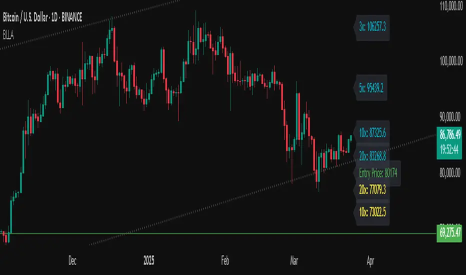
Binance Leveraged Liquidations ApproximationBinance Leveraged Liquidations Approximation (BLLA)
The Binance Leveraged Liquidations Approximation (BLLA) indicator is a tool designed to estimate liquidation levels for leveraged trading on Binance. It calculates the approximate prices at which liquidations could occur for long and short positions, based on the entry price and leverage levels selected by the user.
Key Features:
Liquidation Level Calculation:
Estimates liquidation prices for multiple leverage levels (e.g., 20x, 10x, 5x, etc.).
Supports both long and short positions.
Customization:
Allows the user to manually input the entry price or automatically calculate it as the midpoint between the low and high of a defined period.
Leverage levels are configurable, enabling the indicator to adapt to different trading strategies.
Clear Visualization:
Displays liquidation levels directly on the chart, with labels indicating the corresponding leverage.
Uses distinct colors for long positions (yellow) and short positions (blue).
Recommended Use:
Risk Management: Helps identify liquidation levels to adjust stop-loss orders and manage risk in leveraged trading.
Market Analysis: Provides a quick overview of key levels where significant price movements might occur due to mass liquidations.
Settings:
Entry Price: Enter manually or leave at 0.0 to calculate automatically.
Leverage: Configure desired leverage levels (e.g., 20x, 10x, 5x, etc.).
Transparency and Display: Adjust the transparency of the lines and the number of bars displayed.
Quick Instructions:
Add the indicator to your chart.
Enter the entry price or leave it at 0.0 to calculate automatically.
Configure leverage levels according to your strategy.
Observe liquidation levels on the chart and use them to manage your risk.
Note:
This indicator is an approximation and does not guarantee absolute accuracy of liquidation levels, as these may vary depending on market conditions and exchange policies.
New Daily Low with Offset Alert FeatureThis indicator plots the current day’s low as a horizontal line on your chart and provides an optional offset line above it. It’s designed for traders who want to monitor when price is near or breaking below the daily low. You can set alerts based on the built-in alert conditions to be notified whenever the market approaches or crosses below these key levels.
How to Use With Alerts:
1. Add the indicator to your chart and choose a timeframe (e.g., 15 minutes).
2. In the script inputs, enable or adjust the daily low line and any offset percentage if desired.
3. Open the “Alerts” menu in TradingView and select the corresponding alert condition:
• Cross Below Daily Low to detect when price dips below the day’s low.
• Cross Below Daily Low + Offset if you prefer a small cushion above the actual low.
4. Configure the alert’s frequency and notifications to stay updated on potential breakdowns.
This setup helps you catch new lows or near-breakdowns quickly, making it useful for both intraday traders and swing traders watching key support levels.
Earnings Gap UpsBased on research conducted by John Pocorobba and Jason Thompson, the Earnings Gap Ups Indicator is designed to identify three types of earnings gaps, key levels, and the "alpha window"—a period when stocks often outperform following a gap. These gaps are frequently observed in high-performing stocks.
What is an Earnings Gap?
An earnings gap occurs when a stock's price makes a significant jump, after the company reports earnings signifying the street (institutions) were caught off guard.
The three different types of gaps are as follows: [/b
PEG (Power Earnings Gap)
Price gain of 10% or more
Volume is greater than 200% above the 50-day average
EPS surprise of at least 20%
Monster Gap
Price gain of 20% or more
Volume is greater than 300% above the 50-day average
No fundamental requirement
Monster Peg
Price Gain of 20% or more
Volume is greater than 300% above the 50-day average
EPS surprise of at least 20%
Key Levels and the Alpha Window
In addition to spotting these gaps, the indicator marks key levels on the chart and extends them through the alpha window, which represents the time period when the stock tends to outperform after the gap.
Key levels include:
High volume close: The closing price on a day with unusually high trading volume
High volume close minus 5%: A potential support level below the high volume close
Gap day high: The highest price reached on the gap day
Gap day low: The lowest price reached on the gap day
By understanding and tracking these gaps and levels, traders can map out a playbook for trading earnings gaps.

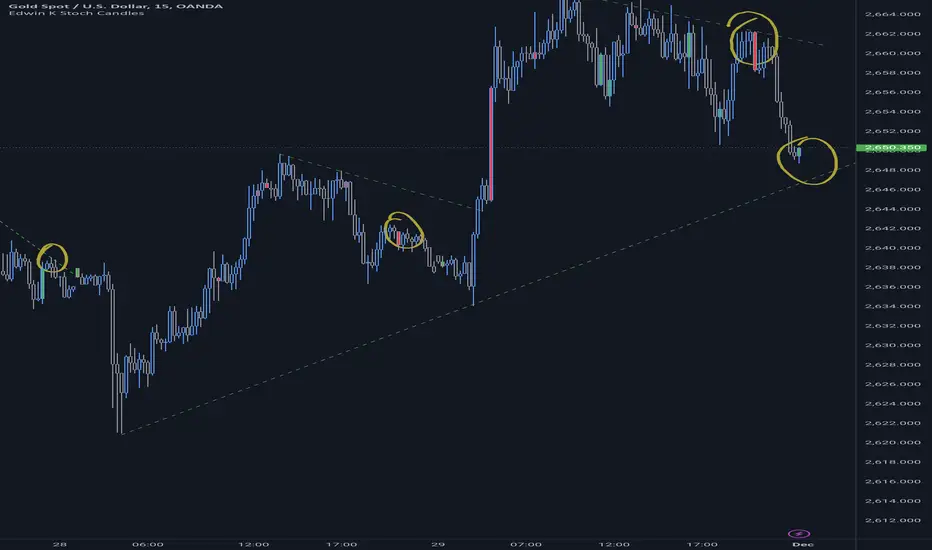
Edwin K Stochastic Candle ColorsThe Stochastic Candle Colors indicator highlights price action using candle colors based on signals from the stochastic oscillator. Here's how to use it:
1. Indicator Purpose
This indicator overlays on your price chart and changes candle colors based on stochastic oscillator signals:
Green candles: Indicate a bullish signal when the %K line crosses above the %D line in an oversold area (below 20).
Red candles: Indicate a bearish signal when the %K line crosses below the %D line in an overbought area (above 80).
2. How to Use the Inputs
K (periodK): The lookback period for calculating the %K line of the stochastic oscillator. A smaller value makes the indicator more sensitive to price changes.
D (periodD): The period for smoothing the %K line to get the %D line. A larger value creates smoother signals but may result in delays.
Smooth (smoothK): The additional smoothing applied to the %K line before calculating the %D line. This helps reduce noise.
3. How to Interpret the Candle Colors
Green Candle:
Occurs when the %K line crosses above the %D line in the oversold zone (below 20).
Signals a potential bullish reversal.
Red Candle:
Occurs when the %K line crosses below the %D line in the overbought zone (above 80).
Signals a potential bearish reversal.
No Color:
No crossover occurs, or the crossover doesn't happen in overbought/oversold zones.
4. Application in Trading
Entry Points:
Buy when you see a green candle and confirm with other indicators or chart patterns.
Sell when you see a red candle and confirm with additional signals.
Trend Context:
Combine this indicator with trend-following tools like moving averages or support/resistance levels to improve accuracy.
Stop Loss/Take Profit:
Use nearby swing highs/lows for stop-loss placement.
Set profit targets based on risk-reward ratios or key levels.
5. Customization
Adjust the input parameters (K, D, and Smooth) to align the indicator's sensitivity with your trading style:
Short-term traders might prefer lower values for quicker signals.
Long-term traders might opt for higher values for smoother, more reliable signals.
6. Limitations
Signals in isolation might not be reliable. Always use this indicator in conjunction with other tools.
Avoid using during low volatility or sideways markets as stochastic oscillators can produce false signals.
VWAP Periodic Close [LuxAlgo]The VWAP Periodic Close script offers an advanced tool for analyzing the Volume Weighted Average Price (VWAP) across various timeframes.
This tool enables traders to visualize VWAP close levels for daily, weekly, monthly, quarterly, and yearly periods, offering a comprehensive view of price behavior across different time frames. It helps in identifying key levels where the VWAP closes at the end of each specified period.
🔶 USAGE
This script is designed to enhance your trading strategy by plotting VWAP close levels on your chart for different time periods. This helps traders easily identify historical VWAP levels and analyze price action relative to these levels, particularly useful for identifying key support and resistance levels providing insights into potential future price behavior.
Supports VWAP closes for multiple timeframes, including historical periods (e.g., 3 months back, 3 quarters back, 3 years back). The labels provide context and detailed information about the VWAP close at a specific point in time and enhance the clarity and usefulness of the VWAP data presented on the chart.
Users can toggle the display of VWAP lines for different periods and customize the colors for each timeframe (e.g., distinct colors for monthly, quarterly, and yearly closes).
🔶 SETTINGS
The script offers a range of customizable settings to tailor the analysis to your trading needs.
🔹 Volume Weighted Average Price (VWAP)
VWAP Close Level: Toggle the display of VWAP levels at the end of each period (daily, weekly, monthly, quarterly, yearly).
VWAP Origin: Toggle the display of the VWAP line for each period.
VWAP Source: Choose the data source for VWAP calculations (default is HLC3).
Historical Closes: Define the number of historical VWAP levels to plot.
Line/Label Offset: Adjust the offset for positioning lines and labels on the chart.
🔹 Themes
Theme Selection: Choose between "Day," "Night," or "Custom" themes to adjust the color scheme of VWAP lines and labels.

MM Day Trader LevelsAs an intraday trader, there are certain key levels that I care about for short-term price action on every single chart. When I first began day trading, each morning I would painstakingly mark those key levels off on the charts I planned to trade each day. Depending on the number of charts I was watching, this would take up quite a bit of my time that I felt would have been much better spent doing other things. It also meant that those levels would often be left behind, and on later days I might be trading a symbol and get confused when a line appeared and I'd be paying attention to it only to later discover that it wasn't from prior day, but from some other day in the past when I had marked it off.
I looked all over TradingView to find indicators that did this automatically for me, and I found a lot of them. One by one I tried them, and inevitably I would always find that something was wrong with them. Often they didn't have all of the levels I wanted (so I would have to combine multiple indicators), but more often I found that the levels would be incorrect, or they would be buggy and not appear consistently, or they would not appear at the right time, or they would not work on futures! The list of problems went on and on. And the biggest issue I found was that nobody knew how to get session volume profile in an indicator.
So, over the course of a few years I figured out how to solve all of those problems and now I'm thrilled to present this free indicator for everyone like me who trades intraday and wants a clean consistent way to see the prior day levels that they care about automatically on every single chart (even futures). The levels the indicator provides are:
Yesterday High & Low
Value Area High & Low & Point of Control
Today's Open
Yesterday's Close (aka "Settlement" on futures)
Premarket High & Low (non-futures only)
Overnight High & Low (futures only)
These levels are extremely important, and I expect price to be reactive to them, so each level has a shaded background behind it so that the levels stand out against other lines you may have on your chart. I try to keep configuration as simple as possible, but there are configuration options that allow you to:
Hide any of the levels
Change the color for the levels
Shade the value area (or not)
Change the label text, size, type (basic label or plain text) and location (how far to the right of last candle to place the label
Adjust session volume profile value area volume & number of rows
The biggest advantage to this indicator over others on TradingView is how it handles session volume profile. When it comes to futures, TradingView does differentiate between regular trading hours and "electronic" trading hours on the charts, but their timeframes for those sessions are unusual, and they do not provide any programmatic way to differentiate between them. So, I created a whole new library for dealing with futures sessions that is fully integrated into both my Session Volume Profile library and this indicator, allowing me to bring you the best and only custom indicator available on TradingView that provides you with true regular session volume profile information across every type of symbol, including futures.
I'm incredibly proud of everything I've been able to provide with this indicator, and even more thrilled to say that I'm proud of how the indicator has been implemented. Once again releasing this indicator and all associated code for free and open source. I encourage you to take a look at the source code to see how it all works, take advantage of the free underlying libraries I created to make all of this possible: Session Library and Session Volume Profile Library.
Visible Range Support and Resistance [AlgoAlpha]🌟 Introducing the Visible Range Support and Resistance 🌟
Discover key support and resistance levels with the innovative "Visible Range Support and Resistance" indicator by AlgoAlpha! 🚀📈 This advanced tool dynamically identifies significant price zones based on the visible range of your chart, providing traders with crucial insights for making informed decisions.
Key Features:
Dynamic support and resistance levels based on visible chart range 📏
User-defined resolution for tailored analysis 🎯
Clear visual representation of significant key zones 🖼️
Easy integration with any trading strategy 💼
How to Use:
🛠 Add the Indicator : Add the indicator to favourites. Adjust settings like resolution and horizontal extension to suit your trading style.
📊 Market Analysis : Identify key support and resistance zones based on the highlighted areas. These zones indicate significant price levels where the market may react.
How it Works:
The indicator segments the price range into user-defined resolutions, analyzing the highest and lowest points to establish boundaries. It calculates the frequency of price action within these segments, highlighting key levels where price movements are least concentrated (areas where price tends to pivot). Customizable settings like resolution and horizontal extension allow for tailored analysis, while the intuitive visual representation makes it easy to spot potential support and resistance zones directly on your chart.
By leveraging this indicator, you can gain deeper insights into market dynamics and improve your trading strategy with data driven support and resistance analysis. Happy trading! 💹✨

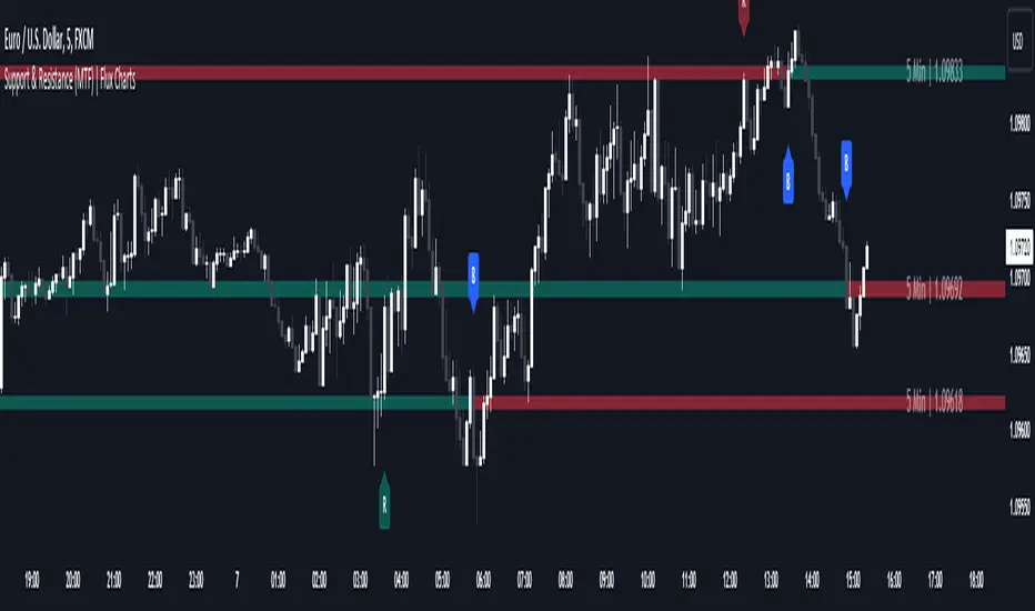
Support and Resistance (MTF) | Flux Charts💎 GENERAL OVERVIEW
Introducing a groundbreaking support and resistance indicator designed to revolutionize your trading experience on TradingView! This innovative tool operates across three distinct timeframes, offering a comprehensive view of market dynamics to help you make informed trading decisions.
The indicator offers a large variety of features :
Select Up To 3 Timeframes
Select Strength Of Supports & Resistances
Select Between Zones & Lines
Show Breaks & Restests
Break & Retest Alerts
Avoid False Breaks
Inverse Color After Broken
Expand Lines & Zones
🚩UNIQUENESS
What sets this indicator apart is its ability to seamlessly integrate and analyze support and resistance levels across multiple timeframes simultaneously. By combining data from three different timeframes, this indicator provides a holistic perspective on market trends and key levels. The adaptive nature of this tool ensures a dynamic assessment of support and resistance zones, empowering traders to adapt to changing market conditions efficiently.
⚙️SETTINGS
1. General Configration
Support & Resistance Count -> Select between 1-3 support & resistance zones for each timeframe.
Pivot Range -> The pivot range is taken into calculations when finding high & low pivots in the chart. Increase if you need a more general look at the support & support zones, or decrease if you need a more detailed look.
Strength -> The strength of the support & resistance zones are determined by how many times the price touched the zone in the past. You can increase the strength up to 4.
Expand Lines & Zones -> If enabled, the support & resistance zones will be expanded to both left and right infinitely. If disabled, the support & resistance zones will be clamped between the time they are first seen, and the time they become broken.
2. Support & Resistance Zones
Enable Zones -> The support & resitsance lines will be converted to zones if enabled.
Zone Width -> The width of the zones. 1 -> %0.05, 2 -> %0.06, 3 -> %0.075.
3. Timeframes
Enable & Disable up to 3 different timeframes using the checkboxes. You can set the timeframes using the selectboxes.
4. Breaks & Retests
Show Breaks -> Points the break points with a blue label with the text "B" on it.
Show Retests -> Points the times when the support & resistance zones are being retested in the current chart.
Avoid False Breaks -> If enabled, the algorithm will try to avoid false break points by comparing the average volume of the point to a longer average volume.
Break Volume Threshold % -> If "Avoid False Breaks" option is enabled, the average volume of the break point should surpass the general average volume by this percent. Higher values mean it's less likely to be a break.
Inverse Color After Broken -> As broken support & resistance zones often become resistance & support zones respectively, if you enable this option the broken zones will inverse their color.
5. Alerts
To make the alerts work, you'll need to add an alert to the chart using the TradingView® alert feature.
Enable Retest Alerts -> You will receive alerts when restests happen on any of the support & resistance zones. "Show Retests" option needs to be enabled to get alerts of this category.
Enable Break Alerts -> You will receive alerts when breaks happen on any of the support & resistance zones.
ICT Concepts [LuxAlgo]The ICT Concepts indicator regroups core concepts highlighted by trader and educator "The Inner Circle Trader" (ICT) into an all-in-one toolkit. Features include Market Structure (MSS & BOS), Order Blocks, Imbalances, Buyside/Sellside Liquidity, Displacements, ICT Killzones, and New Week/Day Opening Gaps.
🔶 SETTINGS
🔹 Mode
When Present is selected, only data of the latest 500 bars are used/visualized, except for NWOG/NDOG
🔹 Market Structure
Enable/disable Market Structure.
Length: will set the lookback period/sensitivity.
In Present Mode only the latest Market Structure trend will be shown, while in Historical Mode, previous trends will be shown as well:
You can toggle MSS/BOS separately and change the colors:
🔹 Displacement
Enable/disable Displacement.
🔹 Volume Imbalance
Enable/disable Volume Imbalance.
# Visible VI's: sets the amount of visible Volume Imbalances (max 100), color setting is placed at the side.
🔹 Order Blocks
Enable/disable Order Blocks.
Swing Lookback: Lookback period used for the detection of the swing points used to create order blocks.
Show Last Bullish OB: Number of the most recent bullish order/breaker blocks to display on the chart.
Show Last Bearish OB: Number of the most recent bearish order/breaker blocks to display on the chart.
Color settings.
Show Historical Polarity Changes: Allows users to see labels indicating where a swing high/low previously occurred within a breaker block.
Use Candle Body: Allows users to use candle bodies as order block areas instead of the full candle range.
Change in Order Blocks style:
🔹 Liquidity
Enable/disable Liquidity.
Margin: sets the sensitivity, 2 points are fairly equal when:
'point 1' < 'point 2' + (10 bar Average True Range / (10 / margin)) and
'point 1' > 'point 2' - (10 bar Average True Range / (10 / margin))
# Visible Liq. boxes: sets the amount of visible Liquidity boxes (max 50), this amount is for Sellside and Buyside boxes separately.
Colour settings.
Change in Liquidity style:
🔹 Fair Value Gaps
Enable/disable FVG's.
Balance Price Range: this is the overlap of latest bullish and bearish Fair Value Gaps.
By disabling Balance Price Range only FVGs will be shown.
Options: Choose whether you wish to see FVG or Implied Fair Value Gaps (this will impact Balance Price Range as well)
# Visible FVG's: sets the amount of visible FVG's (max 20, in the same direction).
Color settings.
Change in FVG style:
🔹 NWOG/NDOG
Enable/disable NWOG; color settings; amount of NWOG shown (max 50).
Enable/disable NDOG ; color settings; amount of NDOG shown (max 50).
🔹 Fibonacci
This tool connects the 2 most recent bullish/bearish (if applicable) features of your choice, provided they are enabled.
3 examples (FVG, BPR, OB):
Extend lines -> Enabled (example OB):
🔹 Killzones
Enable/disable all or the ones you need.
Time settings are coded in the corresponding time zones.
🔶 USAGE
By default, the indicator displays each feature relevant to the most recent price variations in order to avoid clutter on the chart & to provide a very similar experience to how a user would contruct ICT Concepts by hand.
Users can use the historical mode in the settings to see historical market structure/imbalances. The ICT Concepts indicator has various use cases, below we outline many examples of how a trader could find usage of the features together.
In the above image we can see price took out Sellside liquidity, filled two bearish FVGs, a market structure shift, which then led to a clean retest of a bullish FVG as a clean setup to target the order block above.
Price then fills the OB which creates a breaker level as seen in yellow.
Broken OBs can be useful for a trader using the ICT Concepts indicator as it marks a level where orders have now been filled, indicating a solidified level that has proved itself as an area of liquidity. In the image above we can see a trade setup using a broken bearish OB as a potential entry level.
We can see the New Week Opening Gap (NWOG) above was an optimal level to target considering price may tend to fill / react off of these levels according to ICT.
In the next image above, we have another example of various use cases where the ICT Concepts indicator hypothetically allow traders to find key levels & find optimal entry points using market structure.
In the image above we can see a bearish Market Structure Shift (MSS) is confirmed, indicating a potential trade setup for targeting the Balanced Price Range imbalance (BPR) below with a stop loss above the buyside liquidity.
Although what we are demonstrating here is a hindsight example, it shows the potential usage this toolkit gives you for creating trading plans based on ICT Concepts.
Same chart but playing out the history further we can see directly after price came down to the Sellside liquidity & swept below it...
Then by enabling IFVGs in the settings, we can see the IFVG retests alongside the Sellside & Buyside liquidity acting in confluence.
Which allows us to see a great bullish structure in the market with various key levels for potential entries.
Here we can see a potential bullish setup as price has taken out a previous Sellside liquidity zone and is now retesting a NWOG + Volume Imbalance.
Users also have the option to display Fibonacci retracements based on market structure, order blocks, and imbalance areas, which can help place limit/stop orders more effectively as well as finding optimal points of interest beyond what the primary ICT Concepts features can generate for a trader.
In the above image we can see the Fibonacci extension was selected to be based on the NWOG giving us some upside levels above the buyside liquidity.
🔶 DETAILS
Each feature within the ICT Concepts indicator is described in the sub sections below.
🔹 Market Structure
Market structure labels are constructed from price breaking a prior swing point. This allows a user to determine the current market trend based on the price action.
There are two types of Market Structure labels included:
Market Structure Shift (MSS)
Break Of Structure (BOS)
A MSS occurs when price breaks a swing low in an uptrend or a swing high in a downtrend, highlighting a potential reversal. This is often labeled as "CHoCH", but ICT specifies it as MSS.
On the other hand, BOS labels occur when price breaks a swing high in an uptrend or a swing low in a downtrend. The occurrence of these particular swing points is caused by retracements (inducements) that highlights liquidity hunting in lower timeframes.
🔹 Order Blocks
More significant market participants (institutions) with the ability of placing large orders in the market will generally place a sequence of individual trades spread out in time. This is referred as executing what is called a "meta-order".
Order blocks highlight the area where potential meta-orders are executed. Bullish order blocks are located near local bottoms in an uptrend while bearish order blocks are located near local tops in a downtrend.
When price mitigates (breaks out) an order block, a breaker block is confirmed. We can eventually expect price to trade back to this breaker block offering a new trade opportunity.
🔹 Buyside & Sellside Liquidity
Buyside / Sellside liquidity levels highlight price levels where market participants might place limit/stop orders.
Buyside liquidity levels will regroup the stoploss orders of short traders as well as limit orders of long traders, while Sellside liquidity levels will regroup the stoploss orders of long traders as well as limit orders of short traders.
These levels can play different roles. More informed market participants might view these levels as source of liquidity, and once liquidity over a specific level is reduced it will be found in another area.
🔹 Imbalances
Imbalances highlight disparities between the bid/ask, these can also be defined as inefficiencies, which would suggest that not all available information is reflected by the price and would as such provide potential trading opportunities.
It is common for price to "rebalance" and seek to come back to a previous imbalance area.
ICT highlights multiple imbalance formations:
Fair Value Gaps: A three candle formation where the candle shadows adjacent to the central candle do not overlap, this highlights a gap area.
Implied Fair Value Gaps: Unlike the fair value gap the implied fair value gap has candle shadows adjacent to the central candle overlapping. The gap area is constructed from the average between the respective shadow and the nearest extremity of their candle body.
Balanced Price Range: Balanced price ranges occur when a fair value gap overlaps a previous fair value gap, with the overlapping area resulting in the imbalance area.
Volume Imbalance: Volume imbalances highlight gaps between the opening price and closing price with existing trading activity (the low/high overlap the previous high/low).
Opening Gap: Unlike volume imbalances opening gaps highlight areas with no trading activity. The low/high does not reach previous high/low, highlighting a "void" area.
🔹 Displacement
Displacements are scenarios where price forms successive candles of the same sentiment (bullish/bearish) with large bodies and short shadows.
These can more technically be identified by positive auto correlation (a close to open change is more likely to be followed by a change of the same sign) as well as volatility clustering (large changes are followed by large changes).
Displacements can be the cause for the formation of imbalances as well as market structure, these can be caused by the full execution of a meta order.
🔹 Kill Zones
Killzones represent different time intervals that aims at offering optimal trade entries. Killzones include:
- New York Killzone (7:9 ET)
- London Open Killzone (2:5 ET)
- London Close Killzone (10:12 ET)
- Asian Killzone (20:00 ET)
🔶 Conclusion & Supplementary Material
This script aims to emulate how a trader would draw each of the covered features on their chart in the most precise representation to how it's actually taught by ICT directly.
There are many parallels between ICT Concepts and Smart Money Concepts that we released in 2022 which has a more general & simpler usage:
ICT Concepts, however, is more specifically aligned toward the community's interpretation of how to analyze price 'based on ICT', rather than displaying features to have a more classic interpretation for a technical analyst.

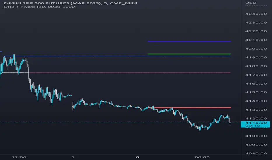
Opening Range & Daily and Weekly PivotsThis script is for a combination of two indicators: an Opening Range Breakout (ORB) indicator and a daily/weekly high/low pivot indicator. The ORB indicator displays the opening range (the high and low of the first X minutes of the trading day, where X is a user-defined parameter) as two lines on the chart. If the price closes above the ORB high, the script triggers an alert with the message "Price has broken above the opening range." Similarly, if the price closes below the ORB low, the script triggers an alert with the message "Price has broken below the opening range."
The daily/weekly high/low pivot indicator plots the previous day's high and low as well as the previous week's high and low. If the current price closes above yesterday's high or last week's high, the script triggers an alert with the messages "We are now trading higher than the previous daily high" and "We are now trading higher than the last week high", respectively. If the current price closes below yesterday's low or last week's low, the script triggers an alert with the messages "We are now trading lower than the previous daily low" and "We are now trading lower than the last week low", respectively.
In addition to the visual representation on the chart, the script also triggers alerts when the price crosses any of these levels. These alerts are intended to help traders make decisions about entering or exiting trades based on the price action relative to key levels of support and resistance.
RSI Step Oscillator [racer8]Purpose of RSO is to identify when RSI has reached key levels. These levels are 80, 70, 60, 40, 30, and 20.
When indicator displays a bar with color...
Purple : RSI > 80
Blue : RSI > 70
Green : RSI > 60
Gray : RSI is inbetween 40 and 60.
Yellow : RSI < 40
Orange : RSI < 30
Red : RSI < 20
Hit the like button and enjoy 😁

Rain On Me PRO 3/3This is the part 3 of Rain On Me PRO. It follow my two other indicators "Rain On Me" and "Rain On Me V2". This version is called "PRO" because it is less "user-friendly" than the two previous versions. But it is more faster, and cleaner than ever!
This indicator is separated into 3 parts. You can find all parts into my profile in the « Scripts » section. Once the 3 parts together, the indicator is complete.
Here are the features for this part:
-MTF Fibonacci on 10 levels with level 0 in the middle and an "info panel" to indicate you the key levels. You can set an alert for each level cross.
-MTF High/Low (Red dots is last low and green dots is last high).
-Bollinger.
-Ichimoku Cloud with baseline (red) and alerts (SenkouA and SenkouB Cross or Tenkan and Kijun Cross).
Everything is fully customizable in settings.
To place an alert, always choose the "Once per bar" option.
Many functions are still to come. So don't hesitate to report bugs, suggestions and follow me to always be kept informed of the next updates to come!
//ALWAYS DELETE INDICATOR AND ALERTS AND RESET THEM AFTER AN UPDATE!
Thank again everyone for your support!
A BIG THANKS TO QUANTNOMAD FOR GIVING ME ITS AUTHORIZATION TO USE, MODIFY AND REPUBLIC ITS "Ultimate Pivot Points Alerts" script indicator:
Good trade everyone! And remember, money management is the most important!
RedK_Supply/Demand Volume Viewer v1Background
============
VolumeViewer is a volume indicator, that offers a simple way to estimate the movement and balance (or lack of) of supply & demand volume based on the shape of the price bar. i put this together few years ago and i have a version of this published for another platform under different names (Directional Volume, BetterVolume) in case you come across them
what is V.Viewer
=====================
The idea here is to find a "simple proxy" for estimating the demand or supply portions of a volume bar - these 2 forces have the potential to affect the current price trend so we want an easy way to track them - or to understand if a stock is in accumulation or distribution - we want to do this without having access to Level II or bid/ask data, and without having to get into the complexity of exploring the lower timeframe price & volume data
- to achieve that, we depend on a simple assumption, that the volume associated with an up move is "demand" and the volume associated with a down move is "Supply". so we basically extrapolate these supply and demand values based on how the bar looks like - a full "green" price bar / candle will be considered 100% demand, and a full "red" price bar will be considered 100% supply - a bar that opens and closes at the same level will be 50/50 split between supply & demand.
- you may say this is a "too simple" of an assumption to make, but believe me, it works :) at least at the basic scenario we need here: i'm just exploring the volume movement and finding key levels - and it provides a good improvement compared to the classic way we see volume on a chart - which is still available here in VolumeViewer.
in all cases, i consider this to be work in progress, so i'd welcome any ideas to improve (without getting too complicated) - there's already a host of great volume-based indicators that will do the multi timeframe drill down, but that's not my scope here.
Technical Jargon & calculation
===========================
1. first we calculate a score % for the volume portion that is considered demand based on the bar shape
skip this part if it sounds too technical => if you're into coding indicators, you would probably know there are couple of different concepts for that algorithm - for example, the one used in Balance Of Power formula - which i'm a big fan of - but the one i use here is different. (how?) this is my own, ant it simply applies double weight for the "wick" parts of a price bar compared to the "body of the bar" -- i did some side-by-side comparison in past and decided this one works better. you can change it in the code if you like
2. after calculating the Bull vs Bears portion of volume, we take a moving average of both for the length you set, to come up with what we consider to be the Demand vs Supply - as usual, i use a weighted moving average (WMA) here.
3. the balance or net volume between these 2 lines is calculated, then we apply a final smoothing and that's the main plot we will get
4. being a very visual person, i did my best to build up the visuals in the correct order - then also to ensure the "study title" bar is properly organized and is simple and useful (Full Volume, Supply, Demand, Net Volume).
- i wish there was a way in Pine to hide a value that i still need to visually plot but don't want it showing its value on the study title bar, but couldn't find it. so the last plot value is repeated twice.
How to use
===========
- V.Viewer is set up to show the simplified view by default for simplicity. so when you first add it to a chart, you will get only the supply vs demand view you can see in the middle pane in the above chart
- Optional / detailed mode: go into the settings, and expose all other plots, you will be able to add the classic volume histogram, and the Supply / Demand lines - note these 2 lines will be overlay-ed on top of each other - this provides an easy way to see who is in control - especially if you change the display of these 2 lines into "area" style. This is what is showing in the lower pane in the above chart.
** Exploring Key Price Levels
- the premise is, at spots where there's big lack of balance, that's where to expect to find key price levels (support / resistance) and these price levels will come into play in future so can be used to set entry / exit targets for our trades - see the example in the AAPL chart where you can easily locate these "balance or reversal levels" using the tops/bottoms/zero-crossings from the Net Volume line
** Use for longer-term Price Analysis
- we can also use this simple indicator to gain more insights (at a high level) of the price in terms of accumulation vs distribution and if the sellers or buyers are in control - for example, in the above AAPL chart, V.Viewer tells us that buyers have been in control since October 19 - even during the recent drop, demand continued to be in play - compare that to DIS chart below for the same period, where it shows that the market was dumping DIS thru the weakness. DIS was bleeding red most of the time
Final thoughts
=============
- V.Viewer is an attempt to enhance the way we see and use Volume by leveraging the shape of the price bar to estimate volume supply & demand - and the Net between the 2
- it will work for stocks and other instruments as long as there's volume data
- note that V.Viewer does not track trend. each bar is taken in isolation of prior bars - the price may be going down and V.Viewer is showing supply going up (absorption scenario?) - so i suggest you do not use it to make decisions without consulting other trend / momentum indicators - of course this is a possible improvement idea, or can be implemented in another indicator, add in trend somehow, or maybe think of making this a +100 / -100 Oscillator .. feel free to play with these thoughts
- all thoughts welcome - if this is useful to you in your trading, please share with other trades here to learn from each other
- the code is commented - please feel free to use it as you like, or build things on top of it - but please continue to credit the author of this code :)
good luck!
-

Institutional Confluence Mapper [JOAT]Institutional Confluence Mapper (ICM)
Introduction
The Institutional Confluence Mapper is an open-source multi-factor analysis tool that combines five analytical modules into a unified confluence scoring system. It synthesizes institutional trading concepts including Relative Rotation analysis, Smart Money flow detection, Liquidity zone mapping, Session-based timing, and Volatility regime classification.
Rather than relying on a single indicator, ICM evaluates market conditions through multiple lenses simultaneously, presenting a clear confluence score (0-100%) that reflects the alignment of various market factors.
This script is fully open-source under the Mozilla Public License 2.0.
Originality and Purpose
This indicator is NOT a random mashup of existing indicators. It is an original implementation that creates a unified institutional analysis framework:
Why Multiple Modules? Most retail traders struggle because they rely on single indicators that provide conflicting signals. Institutional traders evaluate markets through multiple frameworks simultaneously. ICM bridges this gap by providing a unified view of complementary analysis methods.
The Confluence Scoring System: Each module contributes to a weighted confluence score (0-100%). Scores above 65% indicate bullish confluence; below 35% indicates bearish confluence.
How Components Work Together:
RRG (Relative Rotation) determines macro bias - is this asset outperforming or underperforming its benchmark?
Institutional Flow confirms smart money activity - are institutions accumulating or distributing?
Volatility Regime determines strategy selection - trend-follow or mean-revert?
Liquidity Detection identifies key levels - where are the stop hunts happening?
Session Analysis optimizes timing - when should you trade?
The Five Core Modules
1. Relative Rotation Momentum Matrix (RRG)
Compares the current symbol against a benchmark (default: SPY) using the JdK RS-Ratio methodology with double-smoothed EMA. Assets rotate through four quadrants:
LEADING: Outperforming with positive momentum (strongest bullish)
WEAKENING: Outperforming but losing momentum
LAGGING: Underperforming with negative momentum (strongest bearish)
IMPROVING: Underperforming but gaining momentum
2. Institutional Flow Analysis
Analyzes volume patterns to detect smart money activity:
Volume Z-Score measures how unusual current volume is
Buy/Sell pressure estimation based on candle structure
Unusual volume detection highlights institutional activity
3. Volatility Regime System
Uses ATR percentile ranking to classify market conditions:
COMPRESSION: Low volatility (ATR < 20th percentile) - potential breakout
EXPANSION: High volatility (ATR > 80th percentile) - trending
TRENDING_BULL/BEAR: Directional trends based on EMA alignment
RANGING: Sideways consolidation
4. Liquidity Detection
Identifies institutional liquidity targets using swing point analysis:
Swing highs/lows are tracked and displayed as dashed lines
Purple dashed lines mark resistance/sell-side liquidity
Teal dashed lines mark support/buy-side liquidity
Gold diamonds appear when liquidity sweeps are detected (potential reversals)
5. Session Momentum Profiler
Tracks trading sessions based on your selected timezone:
Asian Session: 7PM - 4AM EST
London Session: 3AM - 12PM EST
New York Session: 9:30AM - 4PM EST
London/NY Overlap: 8AM - 12PM EST (peak liquidity)
Visual Elements
Main Dashboard (Top-Right):
BIAS: Overall direction with confluence percentage
RRG: Current quadrant and momentum
FLOW: Smart money bias and volume status
REGIME: Market condition and volatility percentile
SESSION: Active trading session and current time
LIQUIDITY: Active zones and grab signals
SIGNAL: Actionable recommendation
Chart Elements:
Gold Diamond: Liquidity grab (potential reversal point)
Teal Dashed Line: Support / Buy-side liquidity zone
Purple Dashed Line: Resistance / Sell-side liquidity zone
EMA 21/55/200: Trend structure with cloud fill
Volatility Bands: ATR-based channels
How to Use
Step 1: Check the BIAS row for overall market direction
Step 2: Check REGIME to understand market conditions
Step 3: Identify key levels using liquidity zones and EMAs
Step 4: Wait for confluence above 65% (bullish) or below 35% (bearish)
Step 5: Look for gold diamond signals at key levels
Best Setups
Bullish: Confluence >65%, RRG in LEADING/IMPROVING, bullish flow, price near teal support zone.
Bearish: Confluence <35%, RRG in LAGGING/WEAKENING, bearish flow, price near purple resistance zone.
Reversal: Gold diamond appears after price sweeps a liquidity zone.
Key Input Parameters
Benchmark Symbol: Compare against (default: SPY)
RS-Ratio/Momentum Lookback: RRG calculation periods
Volume Analysis Period: Flow detection lookback
Swing Length: Liquidity zone detection
ATR Period/Rank Period: Regime classification
Timezone: Session detection timezone
Alerts
Liquidity Grab Bull: Bullish sweep detected
Liquidity Grab Bear: Bearish sweep detected
High Confluence Bull: Confluence above 70%
High Confluence Bear: Confluence below 30%
Best Practices
Use on 1H, 4H, or Daily timeframes for reliable signals
Combine with price action for confirmation
Respect the regime - don't fight strong trends
Trade during London/NY overlap for best liquidity
Wait for high confluence scores before entering
Always use proper risk management
Limitations
Works best on liquid markets with sufficient volume
Session features optimized for forex/crypto markets
RRG requires a valid benchmark symbol
No indicator predicts the future - use proper risk management
Disclaimer
This indicator is for educational and informational purposes only. It is not financial advice. Trading involves substantial risk of loss. Past performance does not guarantee future results.
-Made with passion by officialjackofalltrades

VolumeValueArea (Double Ref Back)Description :
Overview This indicator is designed for traders who rely on Auction Market Theory and want to identify the market's true Fair Value with precision. It combines two independent Volume Profile instances into a single tool, allowing you to analyze market structure across multiple timeframes simultaneously (e.g., Daily and 4-Hour).
The unique feature of this script is the "Reference Back" logic. Instead of only seeing the current session's profile, you can project the Value Area (VA) and Point of Control (POC) from n periods ago onto the current session. This allows you to immediately see how price reacts to previous areas of high liquidity.
Key Features
Dual Profile Instances: Run two separate profiles (e.g., Profile 1 on 'Daily' and Profile 2 on '4 Hour') within one indicator to find confluence.
Historical Referencing (Offset): Display the levels of past sessions on the current chart.
Offset 0: Shows the developing levels of the current session.
Offset 1: Projects the finished levels of the previous session onto the current price action.
Active Line Projection: Automatically projects the relevant POC and Value Area lines into the future (infinite extension) for the currently active session, making it easy to spot upcoming support and resistance.
Stateless Session Precision: Uses a robust calculation method to ensure session breaks (like the 4-Hour starts) are mathematically precise, regardless of exchange timestamps.
Full Visual Control: Customize line styles (Solid, Dashed, Dotted), widths, and colors for POC, VAH, and VAL independently.
How to Use: Finding Fair Value Clusters
The primary goal of this script is to visualize where "Fair Value" overlaps across different timeframes. This is often called Clustering.
Setup Confluence: Set Profile 1 to a higher timeframe (e.g., Daily) and Profile 2 to a lower timeframe (e.g., 4 Hour or 1 Hour).
Analyze the Context: Set the Reference Back to 1. This allows you to trade the current session while seeing the key levels established in the previous session.
Identify Clusters: Look for areas where the Daily POC/Value Area aligns closely with the H4 POC/Value Area.
Strong Support/Resistance: When a Daily VAH aligns with a 4H POC, it creates a "Cluster" of interest.
Acceptance vs. Rejection: If price moves away from a cluster and creates a new value area, the market is seeking a new fair value. If it rotates around the cluster, fair value is established.
Settings Guide
Session Type: Choose between Daily, Weekly, Monthly, 4 Hour, 1 Hour, etc.
Reference Back (n Periods): Determines which past session's levels are drawn on the current bars. 0 = Current, 1 = Previous, 2 = The one before that.
Resolution: The granularity of the volume profile (higher = more precise).
Extend Active: If enabled, the lines for the current calculation period will extend infinitely to the right until a new session begins.
Styles: Configure independent line styles to visually distinguish between Profile 1 (e.g., solid lines) and Profile 2 (e.g., dashed lines).
Risk Disclaimer This tool is for chart analysis and educational purposes only. Past volume nodes do not guarantee future price reactions. Always manage your risk responsibly.

Gap Level Plotter (4H)# Gap Level Plotter (4H) - User Guide
## Overview
This indicator automatically detects and plots 4-hour gap zones on any chart timeframe. Gaps are price discontinuities where one 4H candle's low is above the previous 4H candle's high (gap up) or where one 4H candle's high is below the previous 4H candle's low (gap down). These levels often act as key support/resistance zones.
## Key Features
- **Works on any timeframe**: View 4-hour gaps on 1-minute, 5-minute, 15-minute, daily charts, etc.
- **Visual gap zones**: Displays translucent purple zones (customizable) that extend into the future
- **Configurable lookback**: Choose how many days of history to scan (30, 45, 60, or 90 days)
- **Gap filtering**: Filter out noise by setting minimum gap sizes in points or percentage
- **Clean and simple**: Gaps remain plotted even after being filled, providing historical context
## Settings
### Lookback Days (Default: 45)
Controls how far back in time to search for gaps.
- **Options**: 30, 45, 60, 90 days
- **Use case**: Increase for long-term analysis, decrease for short-term trading
### Zone Color (Default: Purple)
Customize the color of gap zones to match your chart theme or personal preference.
### Filter Method (Default: Points)
Choose how to filter out small/insignificant gaps:
- **None**: Show all gaps regardless of size
- **Points**: Filter by absolute price points (recommended for futures like NQ/ES)
- **Percentage**: Filter by percentage of price (recommended for stocks)
### Minimum Gap Size (Default: 5.0)
The threshold for filtering gaps based on your selected filter method.
**Recommended settings:**
- **NQ futures**: 5-10 points
- **ES futures**: 2-5 points
- **Stocks (percentage)**: 0.25-0.5%
Adjust based on the instrument's volatility and your trading style.
## Best Practices
1. **For futures (NQ/ES)**: Use "Points" filter with 5-10 point minimum
2. **For stocks**: Use "Percentage" filter with 0.25-0.5% minimum
3. **Clean charts**: If too many gaps clutter your view, increase the minimum gap size or reduce lookback days
4. **Multiple timeframes**: The same gaps appear on all chart timeframes - use this to identify key levels across your analysis
## How to Use
1. Add the indicator to your chart
2. Adjust settings based on your instrument and preferences
3. Gap zones automatically update as new 4H candles form
4. Use zones as potential support/resistance levels for entries, exits, or targets
## Notes
- Gaps are plotted when detected and remain visible even after being filled
- The indicator focuses on 4-hour timeframe gaps specifically, as these tend to be significant levels for intraday and swing trading
- Purple zones extend infinitely to the right to show where price might return to fill or test the gap
---
**Enjoy trading with cleaner gap visualization! 📊**

Gann Octave Pro - Angles & Time Cycles 🎯 Gann Octave Pro - Angles & Time Cycles
## Complete Gann Trading System - Price, Angles & Time in One Indicator
A professional-grade Gann analysis tool combining **Octave Price Levels**, **Gann Angles (1x1, 2x1, 1x2)**, and **Advanced Time Cycle Projections**. Perfect for traders seeking precision market timing through geometric confluence.
---
## 🌟 Key Features
### 📐 Octave Price Levels
- **5 Key Levels**: 0%, 25%, 50%, 75%, 100%
- **Color-Coded**: Green (support) → Blue (50% pivot) → Red (resistance) → Black (boundaries)
- **Dynamic Updates**: Auto-adjusts to swing structure
- **Trading Edge**: 50% level is the most powerful reversal zone
### 📏 Gann Angles
- **1x1 Angle** (Black) - Natural 45° trend line
- **2x1 Angle** (Red) - Steep acceleration zone
- **1x2 Angle** (Red) - Gradual support/resistance
- **Customizable Extension**: Fixed bars or % of swing length
### ⏰ Advanced Time Cycles
**Three Calculation Methods:**
1. **Angle-Level Confluence** ⭐ (Recommended)
- Calculates intersections of Gann angles with octave levels
- Most sophisticated timing system
- Based on price-time geometry
2. **Swing Duration** - Uses actual swing bar length
3. **Harmonic (Swing/8)** - Classic Gann harmonic division
**Cycle Visualization:**
- **Full Cycles** (Purple, solid) - Major turning points, labeled "◆ FC1 (176 bars) "
- **Sub-Cycles** (Blue, dotted) - Minor pivots, labeled "S1 "
- **Mid-Cycles** (Orange, dashed) - Half-cycle inflection points
- **Past Display**: Shows 4 complete past cycles for validation
- **Future Projection**: Projects 8 future cycles for anticipation
---
## 🎯 How to Use
### Quick Start
1. Apply to chart (works all timeframes/instruments)
2. Select period: Default 44 bars (adjust based on timeframe)
3. Choose cycle method: "Angle-Level Confluence" for best results
4. Observe past cycles to validate timing accuracy
### Trading Strategies
**Triple Confluence Setup** (Highest Probability)
- Price at octave level (especially 50%)
- Price touches Gann angle (1x1 most reliable)
- Time cycle arrives (full cycle preferred)
- **Entry**: On confluence | **Stop**: Below/above octave level | **Target**: Next level
**Cycle Anticipation**
- Enter 1-2 bars before cycle line if price at octave level
- Exit at next cycle or target octave level
- **Edge**: Anticipate cycles instead of reacting
**Angle Breakout + Cycle**
- Price breaks 1x1 angle + next cycle within 20 bars
- Hold through cycle, exit at 2x1 angle or next major level
---
## ⚙️ Customization
### Period Selection (88-Based)
11 harmonic options: 3, 6, 11, 22, **44**, 88, 176, 352, 704, 1408, 2816 bars
- **Intraday** (15m-1h): Period 3-4
- **Swing Trading** (4h-Daily): Period 4-5
- **Position Trading** (Daily-Weekly): Period 5-6
### Visual Controls
- **Colors**: Independent for all elements
- **Line Widths**: Separate controls (1-5) for levels, angles, cycles
- **Label Size**: Tiny/Small/Normal/Large (unified)
- **Label Position**: Top/Middle/Bottom
- **Show/Hide**: Toggle any component
### Alerts
- 50% octave level breakouts
- Customizable messages
---
## 💡 Pro Tips
1. **Validate First**: Observe 2-3 past cycles before trading
2. **Adjust to Volatility**: High volatility = lower period (22-44), Low = higher (88-176)
3. **Multiple Timeframes**: Apply on different timeframes for confirmation
4. **Respect 50% Level**: Most powerful reversal zone in Gann theory
5. **Focus on Full Cycles**: Highest probability setups (◆ FC markers)
6. **Combine with Price Action**: Indicator shows WHERE/WHEN, price action shows HOW
---
## 🚀 What Makes It Unique
✅ **Intelligent Confluence Cycles** - Unique angle-level intersection calculation
✅ **Historical Validation** - See past cycles to trust future projections
✅ **Professional Design** - Color-coded hierarchy, clean labels, no clutter
✅ **Complete Automation** - Everything updates in real-time
✅ **Three-Dimensional Analysis** - Price + Angles + Time = complete picture
---
## 📊 Best Markets
- Stock indices (S&P 500, NASDAQ, Dow)
- Forex majors (EUR/USD, GBP/USD, USD/JPY)
- Commodities (Gold, Silver, Oil)
- Crypto (BTC, ETH)
- Liquid stocks
✅ Complete Gann system (price + angles + time)
✅ 3 time cycle methods
✅ Auto swing detection
✅ 4 past + 8 future cycle projections
✅ Professional visualization
✅ Extensive customization
✅ Real-time alerts
✅ Works all markets/timeframes
---
## ⚠️ Disclaimer
This indicator is for educational purposes and applies W.D. Gann methodology principles. Not financial advice. Always use proper risk management, position sizing, and stop losses. Practice on paper before live trading. Past performance doesn't guarantee future results.
---
**The market moves in patterns of price and time. This indicator helps you see them.**
Trade with geometry. Trade with time. Trade with confidence.

Candle Strength Analyzer by The Ultimate Bull Run# Candle Strength Analyzer
## 📊 Complete Beginner's Guide
---
### 🎯 What This Indicator Does
The **Candle Strength Analyzer** measures how "strong" or "weak" each candlestick is and displays a **score from 0 to 100** above or below every candle.
- **Green numbers** = Bullish (price went UP)
- **Red numbers** = Bearish (price went DOWN)
- **Gray numbers** = Doji (price barely moved)
**Higher score = Stronger candle = More reliable signal**
---
### 🕯️ Understanding Candlesticks (The Basics)
If you're new to trading, here's what a candlestick shows:
```
│ ← Upper Wick (prices that were rejected)
│
┌───┐
│ │ ← Body (the "real" price movement)
│ │ • Green/White body = Price went UP (Bullish)
│ │ • Red/Black body = Price went DOWN (Bearish)
└───┘
│
│ ← Lower Wick (prices that were rejected)
```
**Key Terms:**
- **Open**: The price when the candle started
- **Close**: The price when the candle ended
- **High**: The highest price during the candle
- **Low**: The lowest price during the candle
- **Body**: The rectangle between Open and Close
- **Wick/Shadow**: The thin lines above and below the body
---
## 📐 The 4 Components of Candle Strength
This indicator combines **4 measurements** to calculate the final strength score. Let's understand each one:
---
### 1️⃣ Body Ratio (30% of score)
**What it is:**
The percentage of the candle that is "body" versus "wicks."
**Formula:**
```
Body Ratio = Size of Body ÷ Total Candle Size × 100
```
**What it tells you:**
- **High Body Ratio (70-100%)**: Bulls or bears were in FULL control. The price moved in one direction and STAYED there. This is strong.
- **Low Body Ratio (0-30%)**: There was a fight. Price moved up AND down but ended up roughly where it started. This is weak/indecisive.
**Visual Example:**
```
Strong Candle (90% body): Weak Candle (20% body):
│ │
┌───┐ │
│ │ ┌─┴─┐
│ │ ← Mostly body │ │ ← Tiny body
│ │ └─┬─┘
└───┘ │
│ │
```
**How to interpret:**
| Body Ratio | Meaning |
|------------|---------|
| 90-100% | **Marubozu** - Extremely strong, full commitment |
| 70-90% | **Strong** - Clear winner (bulls or bears) |
| 40-70% | **Normal** - Typical market activity |
| 10-40% | **Weak** - Significant indecision |
| 0-10% | **Doji** - Complete indecision, no winner |
---
### 2️⃣ Close Position Score (25% of score)
**What it is:**
WHERE the candle closed within its range (high to low).
**What it tells you:**
- For a **bullish (green) candle**: Closing near the HIGH means buyers were still eager at the end = STRONG
- For a **bearish (red) candle**: Closing near the LOW means sellers were still eager at the end = STRONG
**Visual Example:**
```
Strong Bullish: Weak Bullish:
(closes near high) (closes near middle)
┌───┐ ← Close here │
│ │ ┌─┴─┐ ← Close here
│ │ │ │
│ │ │ │
└───┘ └───┘
│ │
```
**Why it matters:**
If price went UP but then sellers pushed it back down before the candle closed, that's a sign of weakness. The bulls couldn't hold their ground.
**How to interpret:**
| Close Position | For Bullish Candle | For Bearish Candle |
|----------------|-------------------|-------------------|
| 80-100% | Strong (near high) | Weak (near high) |
| 50-80% | Moderate | Moderate |
| 20-50% | Weak | Moderate |
| 0-20% | Very Weak (near low) | Strong (near low) |
---
### 3️⃣ Relative Volume - RVOL (25% of score)
**What is Volume?**
Volume is the NUMBER of shares/contracts traded during that candle. Think of it as "how many people participated."
**What is RVOL?**
RVOL compares TODAY'S volume to the AVERAGE volume.
**Formula:**
```
RVOL = Current Volume ÷ Average Volume (last 20 candles)
```
**What it tells you:**
- **RVOL = 1.0**: Normal activity (same as average)
- **RVOL = 2.0**: DOUBLE the normal activity (2x more traders involved)
- **RVOL = 0.5**: HALF the normal activity (fewer traders involved)
**Why it matters:**
A big price move with LOW volume is suspicious - it might not last.
A big price move with HIGH volume is confirmed - many traders agree.
**Think of it like voting:**
- High volume = Many people voted for this direction
- Low volume = Only a few people voted, decision might change
**How to interpret:**
| RVOL | Meaning | Signal Quality |
|------|---------|----------------|
| 2.0+ | Very High - Institutional activity likely | ⭐⭐⭐ Excellent |
| 1.5-2.0 | High - Significant interest | ⭐⭐ Good |
| 1.0-1.5 | Above Average | ⭐ Acceptable |
| 0.7-1.0 | Below Average | ⚠️ Caution |
| < 0.7 | Low - Lack of interest | ❌ Unreliable |
---
### 4️⃣ Size vs ATR (20% of score)
**What is ATR?**
ATR stands for "Average True Range." It measures how much the price TYPICALLY moves.
**What this component measures:**
How big is THIS candle compared to how big candles USUALLY are?
**Formula:**
```
ATR Ratio = This Candle's Size ÷ Average Candle Size (ATR)
```
**What it tells you:**
- **ATR Ratio = 2.0**: This candle is TWICE as big as normal = Significant move
- **ATR Ratio = 1.0**: This candle is normal sized
- **ATR Ratio = 0.5**: This candle is HALF the normal size = Minor move
**Why it matters:**
A 50-point move in a stock that normally moves 100 points is small.
A 50-point move in a stock that normally moves 20 points is HUGE.
Context matters!
**How to interpret:**
| ATR Ratio | Meaning |
|-----------|---------|
| 2.0+ | **Expansion** - Unusually large move, potential breakout |
| 1.5-2.0 | **Large** - Significant momentum |
| 1.0-1.5 | **Above Average** - Notable move |
| 0.5-1.0 | **Normal** - Typical movement |
| < 0.5 | **Small** - Insignificant, might be noise |
---
## 🧮 How the Final Score is Calculated
The indicator combines all 4 components with these weights:
```
Final Score = (Body Ratio × 30%) +
(Close Position × 25%) +
(RVOL Score × 25%) +
(Size Score × 20%)
```
**Result: A score from 0 to 100**
---
## 📊 Understanding the Strength Score
| Score | Classification | What It Means | Should You Trade It? |
|-------|---------------|---------------|---------------------|
| **70-100** | 🟢 STRONG | High conviction move, reliable signal | ✅ Yes - Good setup |
| **40-70** | 🟡 MODERATE | Average move, needs confirmation | ⚠️ Maybe - Add other indicators |
| **0-40** | 🔴 WEAK | Low conviction, unreliable | ❌ No - Wait for better setup |
---
## 🏷️ Special Pattern Markers
The indicator also detects special candlestick patterns:
### ⚡ Power Candle
**Requirements:**
- Body Ratio > 70% (strong body)
- RVOL > 1.5 (high volume)
- Close Position > 80% (closes near the extreme)
**What it means:** The BEST possible signal. Everything aligns perfectly.
### Ⓜ️ Marubozu
**Requirements:**
- Body Ratio > 90% (almost no wicks)
**What it means:** Complete dominance by bulls or bears. Very strong continuation signal.
### ◆ High Volume Doji
**Requirements:**
- Doji candle (tiny body)
- High volume
**What it means:** Many traders are fighting, but no one won. Often signals a REVERSAL is coming.
---
## ⚙️ Settings Explained
### Volume Settings
| Setting | Default | What It Does |
|---------|---------|--------------|
| Volume Lookback Period | 20 | How many candles to average for "normal" volume |
| RVOL Threshold | 1.5 | What counts as "high" volume (1.5 = 50% above average) |
### ATR Settings
| Setting | Default | What It Does |
|---------|---------|--------------|
| ATR Period | 14 | How many candles to calculate average movement |
| ATR Multiplier | 1.5 | What counts as a "large" candle |
### Strength Thresholds
| Setting | Default | What It Does |
|---------|---------|--------------|
| Strong Candle Threshold | 70 | Score needed to be "strong" |
| Weak Candle Threshold | 30 | Score below this is "weak" |
### Label Filter (Important!)
TradingView limits indicators to **500 labels maximum**. Use filters to see more history:
| Filter Mode | Shows | Best For |
|-------------|-------|----------|
| All Candles | Every single candle | Short-term charts (5min, 15min) |
| Strong Only (70+) | Only strong candles | Longer history, key signals only |
| Moderate+ (40+) | Moderate and strong | Balance of detail and history |
| Custom Minimum | Your choice | Full control |
**Tip:** On daily charts, use "Strong Only" to see months of history instead of just a few weeks.
### Label Settings
| Setting | What It Does |
|---------|--------------|
| Label Size | tiny / small / normal / large |
| Show Decimal Places | Show "72.5" instead of "73" |
| Label Style | With background bubble OR just text |
---
## 📖 How to Read the Info Table
The table in the corner shows details for the CURRENT (most recent) candle:
| Row | Meaning |
|-----|---------|
| **Candle Strength** | The final score (0-100) |
| **Direction** | BULLISH / BEARISH / DOJI |
| **Body Ratio** | Percentage of candle that is body |
| **Close Position** | Where it closed (0-100) |
| **Upper Wick** | Size of upper wick as % |
| **Lower Wick** | Size of lower wick as % |
| **RVOL** | Current volume vs average (1.5x = 50% above average) |
| **Size/ATR** | Candle size vs average size |
| **Classification** | STRONG / MODERATE / WEAK |
| **Vol Confirmed** | Is volume above threshold? |
| **Pattern** | Special pattern detected |
---
## 🎓 How to Use This Indicator
### Step 1: Add to Chart
1. Open Pine Editor in TradingView
2. Paste the code
3. Click "Add to Chart"
### Step 2: Adjust Filter (if needed)
- If you see "max labels reached," change filter to "Strong Only (70+)"
- This lets you see more candles in history
### Step 3: Look for Strong Signals
Focus on candles with:
- ✅ Score **70+** (bright green or red)
- ✅ **RVOL > 1.5** (confirmed by volume)
- ✅ Special markers (⚡, M, ◆)
### Step 4: Avoid Weak Signals
Be careful with candles that have:
- ❌ Score **below 40** (muted colors)
- ❌ **RVOL < 1.0** (no volume confirmation)
- ❌ Large wicks (rejection happened)
---
## 💡 Trading Tips for Beginners
### ✅ DO:
1. **Wait for strong candles (70+)** before entering trades
2. **Confirm with volume** - Look for RVOL > 1.5
3. **Use at support/resistance levels** - Strong candles at key levels are more meaningful
4. **Combine with other indicators** - RSI, MACD, or moving averages
5. **Practice on demo first** - Learn to recognize strong vs weak candles
### ❌ DON'T:
1. **Trade every candle** - Not all candles are worth trading
2. **Ignore volume** - A strong candle with low volume is suspicious
3. **Fight the trend** - Strong bearish candles in an uptrend might just be pullbacks
4. **Over-leverage** - Even strong signals can fail
---
## 📝 Quick Reference Cheat Sheet
```
STRONG CANDLE CHECKLIST:
□ Score 70+
□ RVOL > 1.5
□ Body Ratio > 60%
□ Close Position > 75% (bullish) or < 25% (bearish)
□ At key support/resistance level
WEAK CANDLE WARNING SIGNS:
□ Score < 40
□ RVOL < 0.7
□ Large wicks (> 30%)
□ Doji pattern
□ Small candle (ATR Ratio < 0.5)
```
---
## ⚠️ Important Disclaimers
1. **No indicator is 100% accurate** - Always use stop losses
2. **Past performance ≠ future results** - Markets change
3. **This is a tool, not a strategy** - Combine with other analysis
4. **Practice first** - Use paper trading before real money
---
## 🔔 Alerts Available
Set alerts for:
- Strong Bullish Candle (with volume confirmation)
- Strong Bearish Candle (with volume confirmation)
- Power Candle detected
- Marubozu detected
- High Volume Doji detected
---
## ❓ FAQ
**Q: Why are some candles missing labels?**
A: TradingView limits indicators to 500 labels. Use filters to see more history.
**Q: The label colors are hard to see. Can I change them?**
A: Yes! Go to Settings → Colors and customize all colors.
**Q: Should I only trade strong candles?**
A: Strong candles are MORE reliable, but not guaranteed. Always use proper risk management.
**Q: What timeframe works best?**
A: Works on all timeframes. Higher timeframes (4H, Daily) tend to have more reliable signals.
**Q: Can I use this for crypto/forex/stocks?**
A: Yes! This indicator works on any market with candlestick data and volume.
---
## 📚 Glossary
| Term | Definition |
|------|------------|
| **Bullish** | Price is going UP / Buyers are winning |
| **Bearish** | Price is going DOWN / Sellers are winning |
| **Doji** | Candle where open and close are nearly equal (indecision) |
| **Marubozu** | Candle with no wicks (full body) |
| **RVOL** | Relative Volume - current volume vs average |
| **ATR** | Average True Range - typical price movement |
| **Wick/Shadow** | The thin lines above/below the candle body |
| **Support** | Price level where buyers tend to step in |
| **Resistance** | Price level where sellers tend to step in |
| **Breakout** | When price moves beyond support/resistance |
---
**Happy Trading! 📈**
*Remember: The best traders are patient traders. Wait for strong setups.*

My WatchlistUse Case
Do you belong to a group of traders that post key levels based on their technical analysis to be utilized for trading opportunities? The goal of this indicator is to reduce your daily prep time by allowing you to paste in the actual level values instead of trying to manually create each of the horizontal lines.
How it works
Simply enter the values of the key levels for the tickers that you would like to plot horizontal lines for. If you don't want to plot a level just leave the value as zero and it will be ignored.
Settings
You can enable/disable any of the levels
You can change the colors of the levels
You can add Previous Day High and Previous Day Low levels to the chart
